Last year, we set up a prediction model on crime in London. We had established the model already, grounded in open data, but updated it to make predictions about 2017. We took the data provided by the police in the greater London area, and by enriching this data with Points Of Interest from Ordnance Survey and UK Census data, we created multiple predictive models with Dataiku in order to give these predictions for 2017 at the local LSOA level.
The model was reasonably accurate, considering we only had access to open data (taking into account the level of control we have on open data models). But let’s break down how we established our model’s performance.
BUILDING A DATA PREPARATION FLOW FOR AGGREGATING ON MONTHLY OBSERVATIONS VS PREDICTIONS
The first step was to collect the 2017 police data. I just downloaded the data (fairly) manually onto my computer. The partitioning system of Dataiku adjusts to fit the collected files’ structure, which is how Dataiku controls inserting and updating dataset rows into a meaningful organized structure. Partitioning also helps automate the recurring tasks implied by big data usage.
I partitioned the data based on the month, which helps automate our workflow. Here’s what the updated project flow looked like: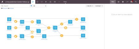
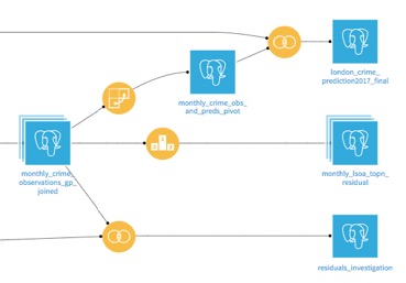
After preparing our data and joining the predictions and the LSOA boundaries, we could compare our predictions to the real observed data. To do that, I computed the residuals, numerical differences between the values as prediction – observed_crimes:

Now we could compute different indicators and reshape our data in order to analyse the predictions:
GRAPHICALLY ESTABLISHING OUR MODEL PERFORMANCE
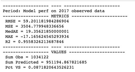
It was then time to generate some insights into the process, which are useful for analyzing the data. On a monthly basis, our R^2metric—an essential reading on model accuracy—is 0.88, which is fair especially when using limited datasets. When we look at the full year, the R^2 metric for LSOA is 0.95, which is better than expected, with a global prediction error of 8.7%.
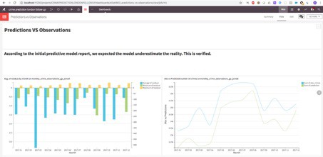
The areas (LSOA) where the residuals are the highest are blue (when the prediction was lower than the actual) and red (when the prediction was higher) on the map. As expected, the predictive model tends to underestimate the number of crimes, which is particularly apparent in the London city centre.
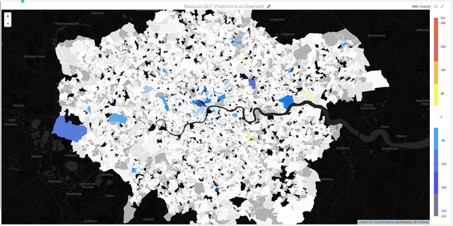
To break down the model performance for 2017:
- Median Average Error (MedAE): 19 crimes
- Global fit: 95%
- Difference vs reality 8.7%
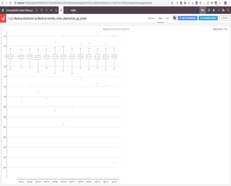
On a monthly basis, extreme residuals were observed in June, September, and December. This highlighted some limitations of the model. One way to improve it would be to add some features related to public events or weather conditions.
LET’S AUTOMATE EVERYTHING!
I created a scenario that will calculate the accuracy statistics for the previous month. Here are the steps:
1. Build the joined observed data and predictions for the previous month (or a specific month as a partition passed by the DSS API if the data are delivered later, this can be easily automated thanks to the DSS Public API
2. Refresh a Jupyter notebook containing some charts and metrics.
3. Build others datasets and refresh the charts cache for sharing the updated insights in a dashboard.
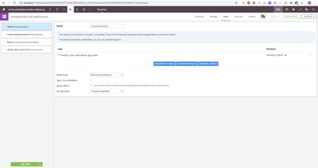
Developing the monthly automation only took a couple of hours at an airport, since Dataiku makes it really easy to push predictive projects into production. This way you don’t have to keep updating them manually, always have up-to-date projects, and most importantly, you retain control of your predictive models. Learn more about pushing analytics into production with our free white paper.
Dataiku presented at Data Natives– the data-driven conference of the future, hosted in Berlin. Join us for the next edition of Data Natives Conference on November 25-26, 2019 in Berlin! We will welcome over 1600 attendees and more than 100 speakers from across the globe to dissect the tech that’s shaping the way we live today — and how we’ll live tomorrow. Get your Early Bird ticket discount now!


